Read Time 6 minutes
Craig Keenan’s negative space
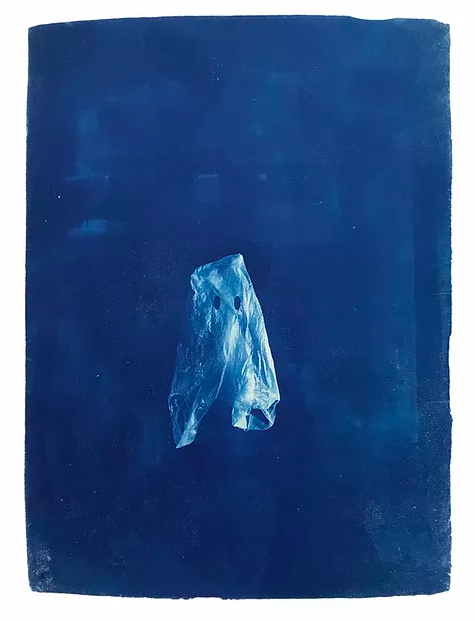
Craig Keenan’s photographs suck us into unnavigable, haunting fantasies. As the viewer we are placed into a blue vacuum with a suspended guest: a tissue paper ghost, a ballerina, the entire sky.

Part of the poetry of Keenan’s works lies in their simplicity. The vast swathes of blue [covering up to 90% of his canvases] open up a space for one or two key figures to be uninterruptedly examined. The blue itself, although an unavoidable ;consequence of the chemical process’ of his cyanotypes, gives these figures a sublime, dream-like environment in which to play. In an exclusive interview with Darklight Art, Keenan reveals his numerous self-imposed boundaries. By limiting his palette, refining his concept, and removing the naming process, the artist opens up his artwork for the viewer’s engagement. We, the viewer, are empowered in our interpretations and reactions.
I much prefer to focus on overall composition, achieving something for the sake of just getting an idea out, or purely because I think it’ll look appealing … I’d rather not muddy the viewer’s engagement with my own thoughts about it
During the interview with Keenan, we discuss his inspirations [surprisingly including artists with deeply colour-focused practices and visually-busy content], his creative process, and how his reduced compositions are a far cry from the “happy accidents” of his childhood creations with a disposable camera.
How did you come to photography?
I’ve been keen on photography for a long time now. The first instance I can think of is being about 13/14 and buying some disposable cameras so I could document hanging out with my friends. The excitement of taking an undeveloped camera to the shop and having to wait to see the results was a big part of the attraction, that and the notion of the happy accident you get through analogue methods. Very often my favourite shots were the wonky ones, the ones with “bad composition” or just something a little off about them. Then I’d start to take pictures in a more abstract way that would make the viewer question what they were seeing.
How would you best describe your composition style?
I’m really struggling with this question for some reason! I don’t know that I have a specific compositional style, other than that which is formed by the process. The ‘painted on photograph’ is always a theme obviously. I tend to fill 90% of my canvas with blue, something I’m trying to dial back a little. A bit of negative space never hurt anyone!
I’m particularly interested in the significance of the colour blue in your cyanotypes – what drew you to blue? What do you think it adds to your compositions?
In all honesty, blue is a consequence of the chemical process of the cyanotype. I do really love the colour it creates, but I work with that as a self-imposed restrain. I find that I work well with limiting factors like colour palette. Actually, from when I got my first proper SLR camera, I’ve pretty much always shot in black and white. I prefer to focus on composition, tone, contrast and texture rather than colour balance. I find it adds too much in the way of decision making and takes away a little from those happy accidents. Having a rule to work with, i.e only making work in monochromatic blue, helps me refine ideas and subject matter to better fit with the process. So, the process absolutely informs the subject matter, composition, style and overall identity of my work now, I guess.
Do you feel that your works are addressing a topic, theme, or problem? What is the driving force behind your work?
I rarely try to address specific themes, ideas or agendas of any kind into my work. Actually I spend time trying to avoid that mostly. I much prefer to focus on overall composition, achieving something either for the sake of just getting an idea out, or documenting a dream, or purely because I think it’ll look appealing. What comes after that is where the joy in art is for me – to show work to people and see what they think of or how it makes them feel is far more interesting than me forcing meaning into things. I think an audience will always bring their own narrative to things they’re interacting with anyway, I’d rather not muddy that engagement with my own thoughts about it. This is large part of why I don’t like naming work, I try my best to avoid leading anyone to think anything specific about the work I make. Having said that, every now and again I’ll make something which unarguably has an agenda or message to it. [See my two ghost prints for examples of this].
monochromatic blue
monochromatic blue
monochromatic blue
What [if any] would you say are your art history influences?
I’m influenced by everyone and everything I see, whether that’s positive or negative. [I like this style or subject so I’ll consciously or subconsciously end up emulating that in my work. Or I really don’t like what I’m seeing and therefore will veer away from that sort of aesthetic.] The artists who stood out to me were always people like Rothko, Pollock, Basquiat, Dali, Man Ray or Warhol in terms of photography – I always felt there was a freedom in work like theirs. So all relatively modern art I’d say. I’ve never been one for classical work at all.
Where do you get your materials? And in what form?
I order the chemicals for the process online, as I’ve never seen them for sale in any art supply store before. I get my negatives made with a company called Ezeeplan. And I order paper to my studio either from John Purcell Paper in Stockwell, or G.F. Smith.

END
All images courtesy of Craig Keenan.
subscribe for the latest artist interviews,
historical heronies, or images that made me.
what are you in the mood for?


